Type Tracing Exercise

For my communication design class today we did a typography exercise. Somehow I felt that it was the one of the most tedious but also anxiety-inducing activity I did this whole week. 
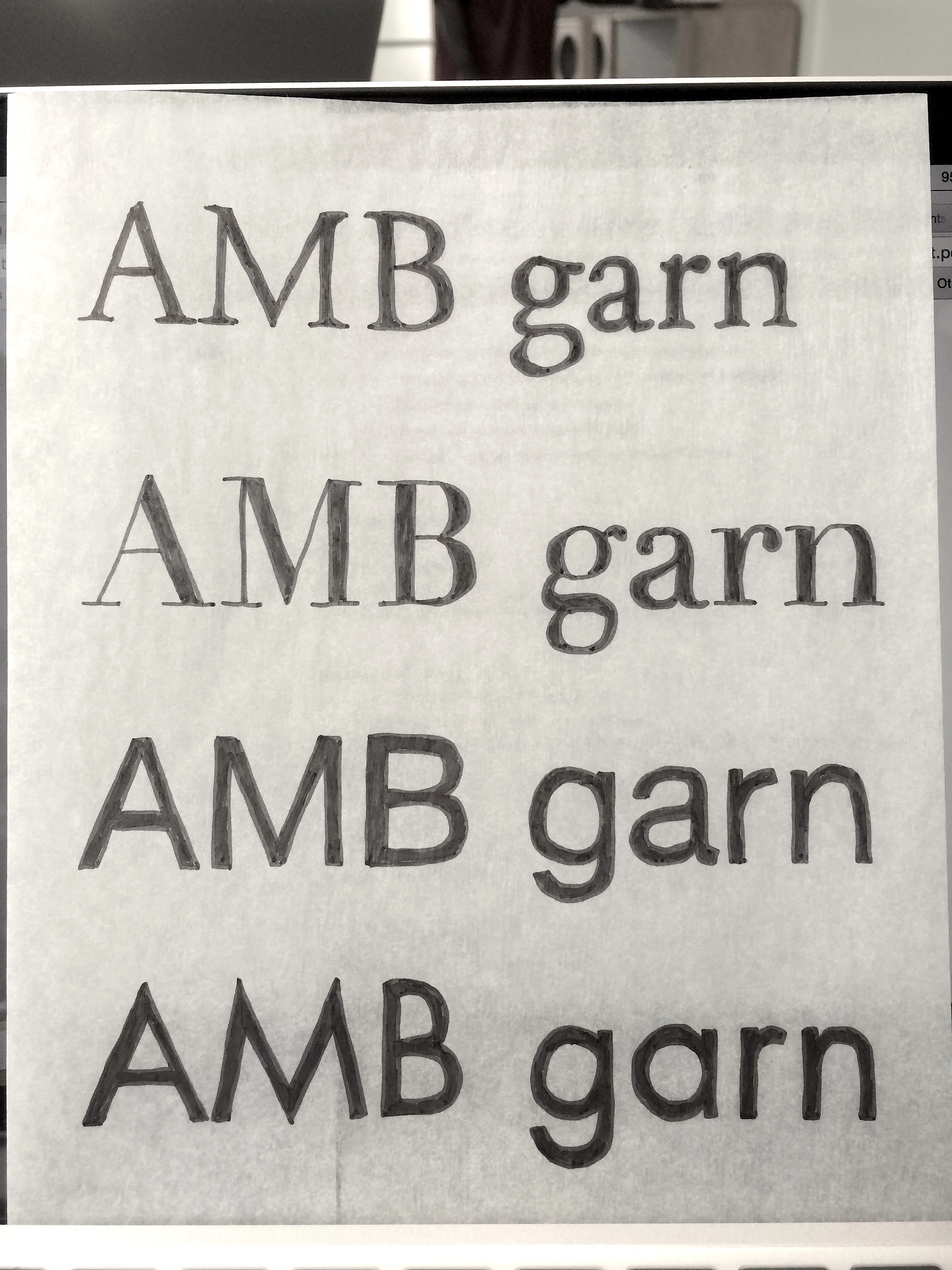
Yes, this tracing exercise was done quite painstakingly. Although it's not perfect, I did get to spend some quality time with my friends AMB and garn. We were supposed to pay special attention to the serifs and teh angle of the curves, the spacing between the letters, and such...
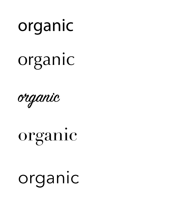
Typographic Voice

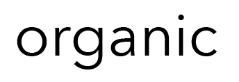
What does the word "organic" look like to you?


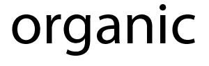
Myriad Pro

This is the default font for Adobe Illustrator, but I thought it fit the word quite well. Myriad is a humanist sans serif typeface. It’s a little plain, but it’s simple, classic, and down to earth.


Screen Shot 2015-09-22 at 10.49.55 AM.png

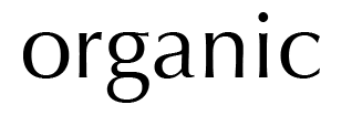
Optima

Optima makes the word include a bit of a classy flair, with the tapered serifs and curvier letters. When I thought of organic, the first thing that came to mind was the organic foods section in Whole Foods, so this typeface was chosen with that in mind.


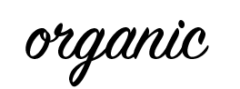
SignPainter-HouseScript

I decided to try a script typeface to see how it would go. Because it’s similar to someone’s handwriting, I thought it might make sense as relating to something animated and “living.” The connected letters definitely make the word seem more alive and less passive than the other typefaces.


Screen Shot 2015-09-22 at 10.50.12 AM.png

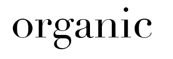
Didot

I tried a lot of sans serif so it I wanted to see how a serif font would look. I kind of like how this turned out, actually. It’s a very structural font. The thin serifs really contrast against the thick, straight lines, but I think it somehow gives it a “natural” look. Or it might just be because there’s a lot of these types of fonts on vegetable packagings.


Avenir Next

Finally, I chose one of my favorite fonts, Avenir Next. I like how the letters are really spaced far apart, giving emphasis to each one and having an elegant and pure overall look.

In the end, I feel like Optima best represents the word. Avenir is a little too open, and Myriad is a little too bold. Optima seems like the best choice that encompasses the word “organic.”

Squares! Thumbnail Sketches

For class we were assigned to create visual representations of certain words using only squares. Here are some of my preliminary sketches. 

IMG_4533.JPG

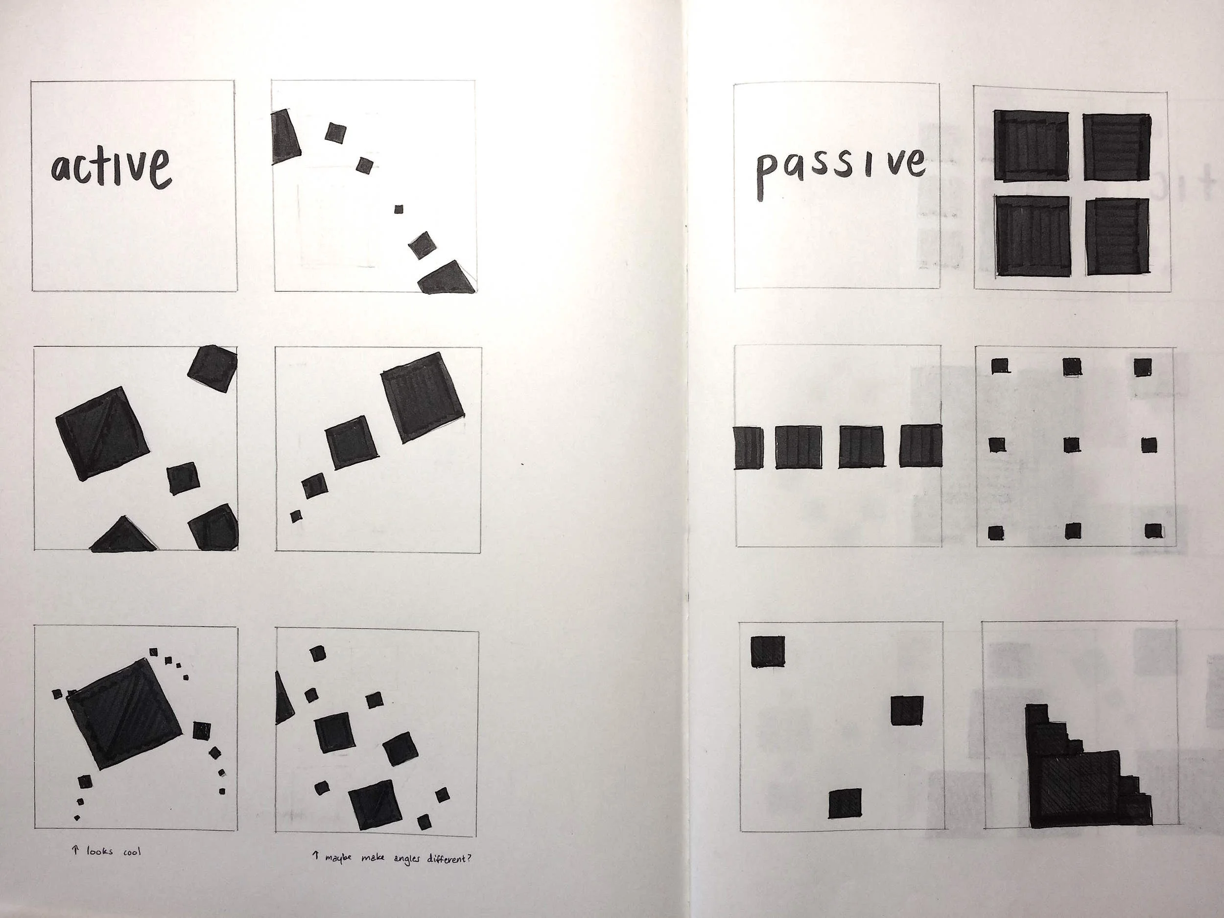
Active vs. Passive

For active squares I wanted to show movement, so I did that by creating squares of different sizes and tilting them to create the illusion of motion. During critiques I got a lot of positive feedback for the last one on the left. For the second one I tried to show how gravity would affect the squares. Passive was definitely a lot less intuitive than active. I tried playing around with different compositions that I thought gave a more calming feeling.


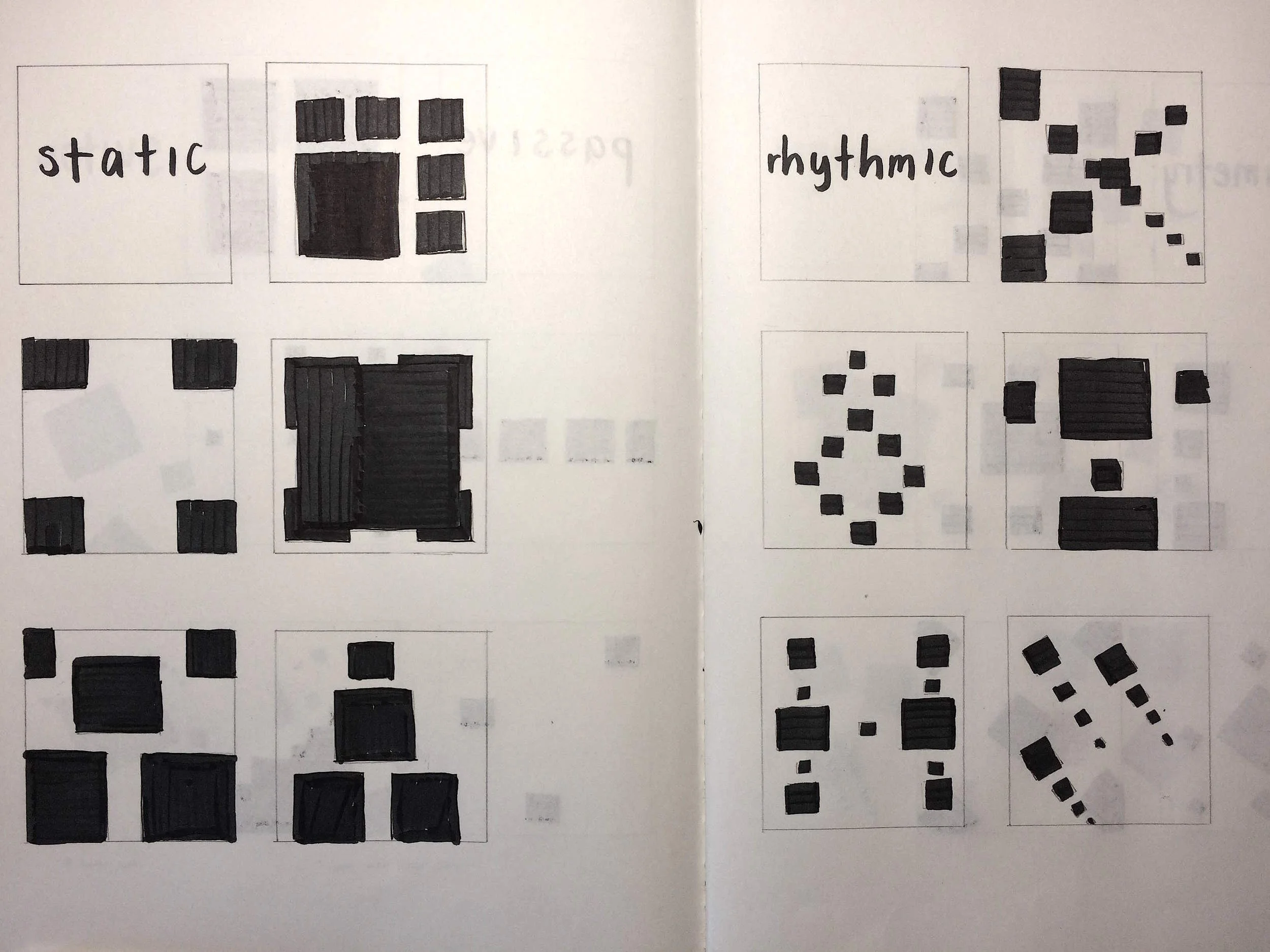
Static vs. Rhythmic

Static made me think of large, unmoving squares. I drew a lot of them stacked on top of each other to show how stable they were. For rhythmic I focused on patterns.


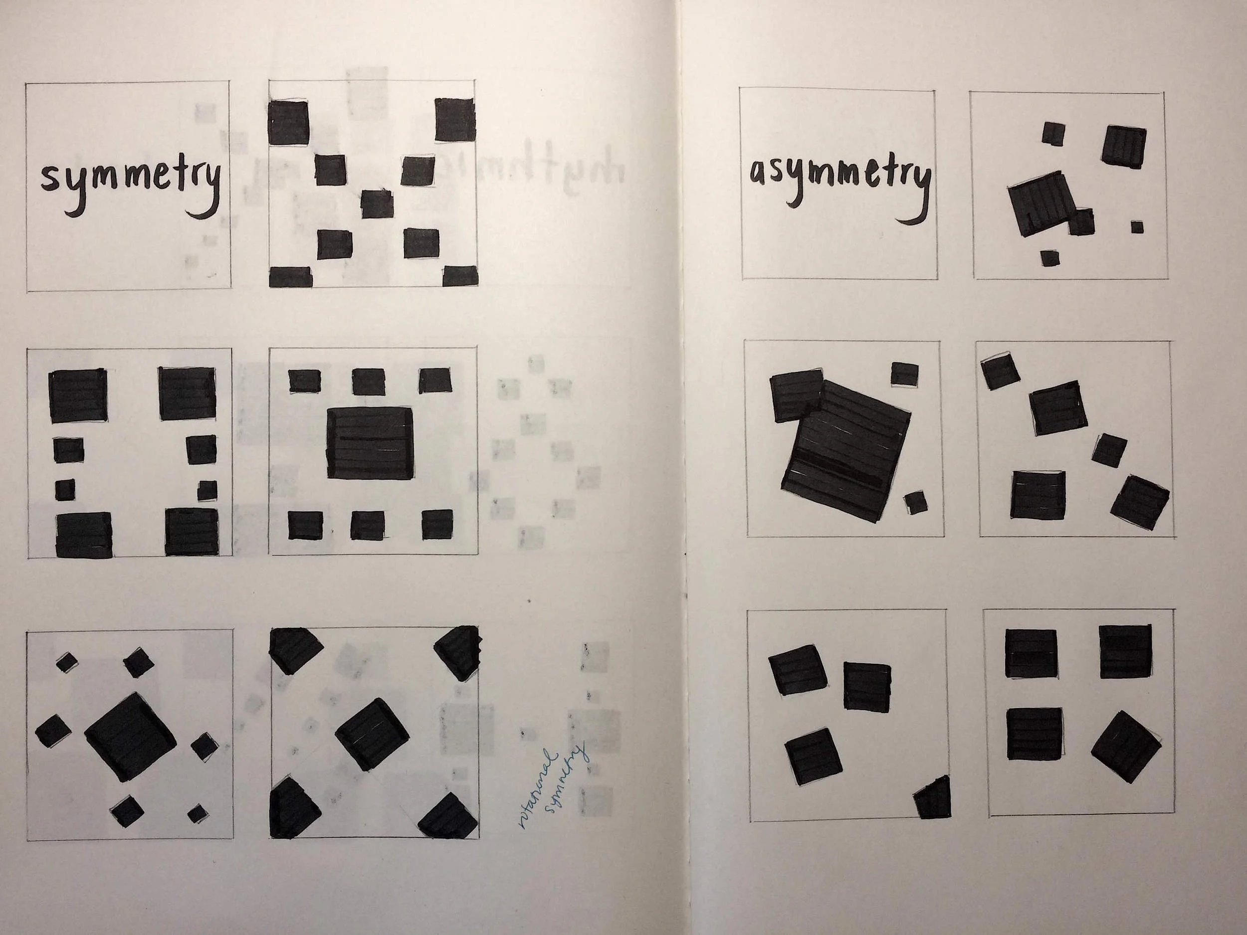
Symmetry vs. Asymmetry

I used vertical, horizontal, and diagonal symmetry. For asymmetry someone commented that they liked the idea of having an odd one out.