What does the word "organic" look like to you?
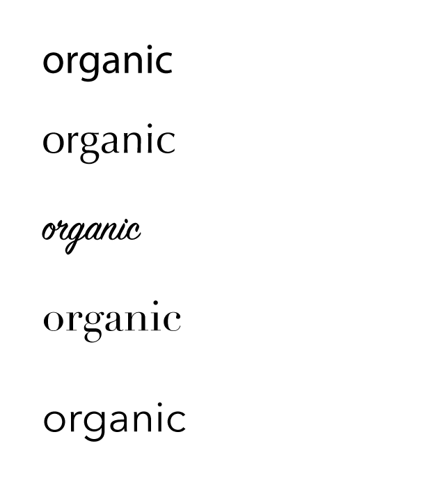
Myriad Pro
This is the default font for Adobe Illustrator, but I thought it fit the word quite well. Myriad is a humanist sans serif typeface. It’s a little plain, but it’s simple, classic, and down to earth.
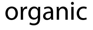
Optima
Optima makes the word include a bit of a classy flair, with the tapered serifs and curvier letters. When I thought of organic, the first thing that came to mind was the organic foods section in Whole Foods, so this typeface was chosen with that in mind.
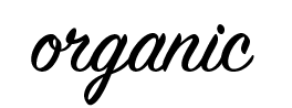
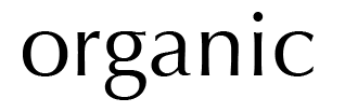
SignPainter-HouseScript
I decided to try a script typeface to see how it would go. Because it’s similar to someone’s handwriting, I thought it might make sense as relating to something animated and “living.” The connected letters definitely make the word seem more alive and less passive than the other typefaces.
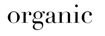
Didot
I tried a lot of sans serif so it I wanted to see how a serif font would look. I kind of like how this turned out, actually. It’s a very structural font. The thin serifs really contrast against the thick, straight lines, but I think it somehow gives it a “natural” look. Or it might just be because there’s a lot of these types of fonts on vegetable packagings.
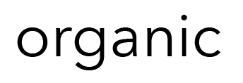
Avenir Next
Finally, I chose one of my favorite fonts, Avenir Next. I like how the letters are really spaced far apart, giving emphasis to each one and having an elegant and pure overall look.
In the end, I feel like Optima best represents the word. Avenir is a little too open, and Myriad is a little too bold. Optima seems like the best choice that encompasses the word “organic.”